Where I took over
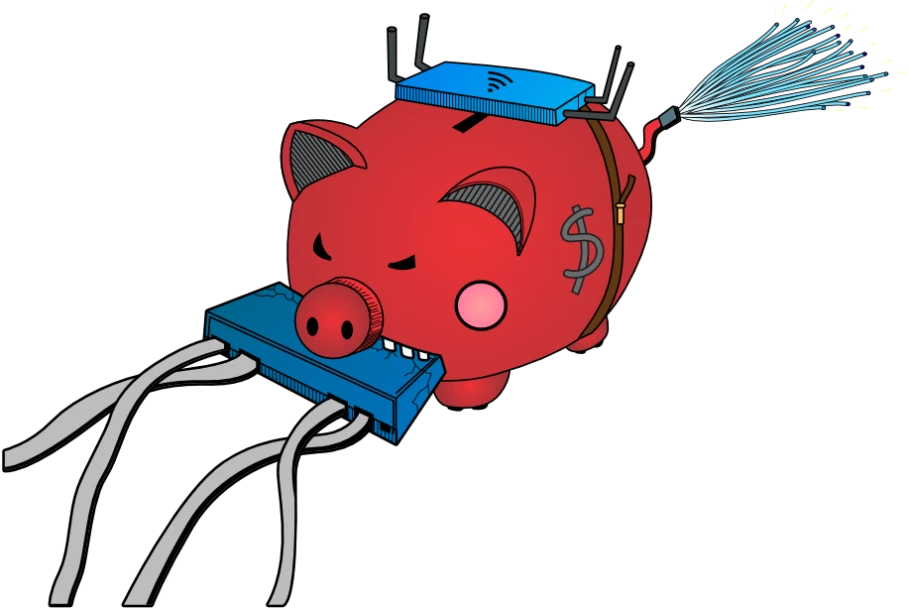
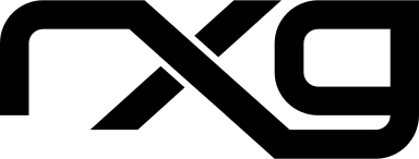
Research found several things wrong with the brand, with the most important being: many people didn’t know the product was called the rXg, some called it “the RG Nets.” The product logo was hard to read and too subtle, closer to a brand decoration than a product mark. The piggy bank and main logo were gaining traction, but the pig carried negative connotations for the brand.
The job was to refine the main logo mark while keeping the qualities that worked. Since people confused the product with the company, we kept the product logo deliberately close to the company mark — so if someone saw the rXg logo without the company logo, it would still be recognizable. The original piggy-bank artwork held sentimental value for legacy customers, so we kept it, but out of front-facing marketing.
The 2020 rebrand

03 · The in-between
Keeping a brand consistent doesn’t mean it can’t grow
In-house designers know a brand is a living thing. I worked on the RG Nets brand for six years — adapting to shifting marketing and sales messaging, constantly improving what added value and cutting what didn’t. There were two main rebrands, in 2020 and 2025. All the work in between subtly moved the needle.
Where I last left it
In 2025 we entered another brand shift. The company was maturing and wanted to update the logo to include the piggy bank. I took it as the opportunity to instill a new look that would align with the trends emerging because of AI.
I took inspiration from retro-futurism and technology themes. As a network-automation company and a technology leader in the field, I wanted the brand to catch the AI wave — a look that would hold up in a new, fast-changing landscape.
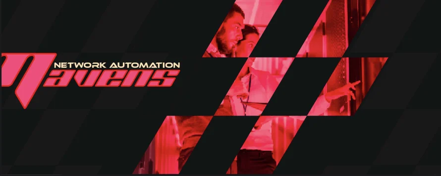
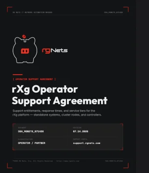
RG Nets 2025 — retro-futurist operator console